
12 Min Read

Redesigning Sportsbook Into the Modern Era
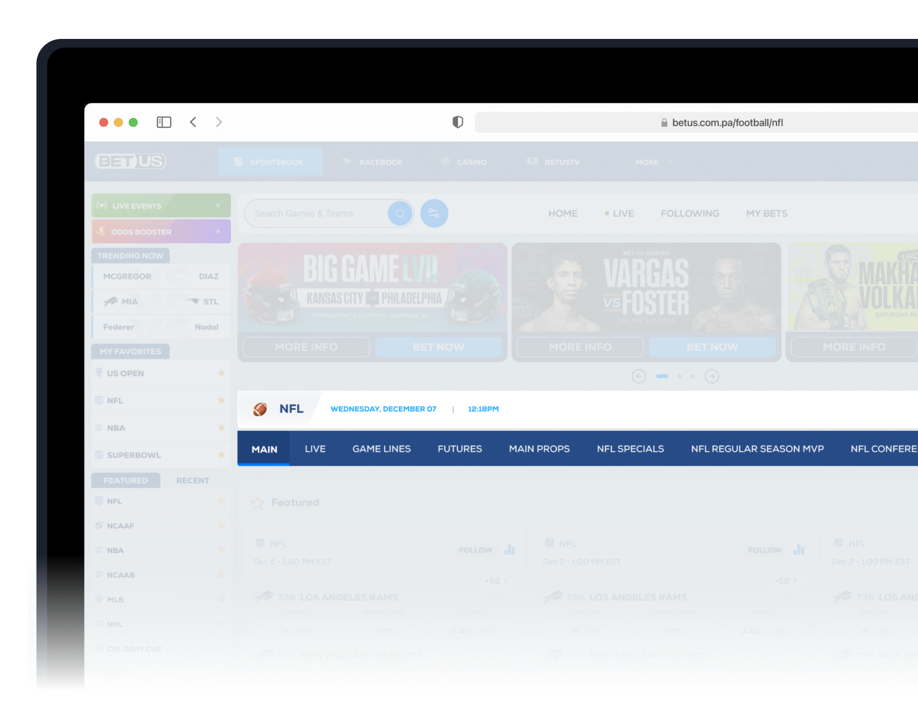
Despite serving over 50,000 users daily, the current sportsbook platform is beginning to show significant usability issues. Users face poor navigation flow, location-related inconsistencies, and low engagement with marketing banners (CTR below 1%). Other pain points include overwhelming information density, unclear odds presentation, and unnecessarily complex user journeys.
These issues are increasingly detrimental to the business, especially as competitors in the rapidly growing online betting market continue to deliver more intuitive, user-friendly experiences.


By Richard • Noor • Javier
But First
What Is BetUS Sportsbook?
BetUS Sportsbook is the platform’s hub for sports wagering, offering odds, live betting, and multiple bet types across a wide range of professional and college sports.


The before & After


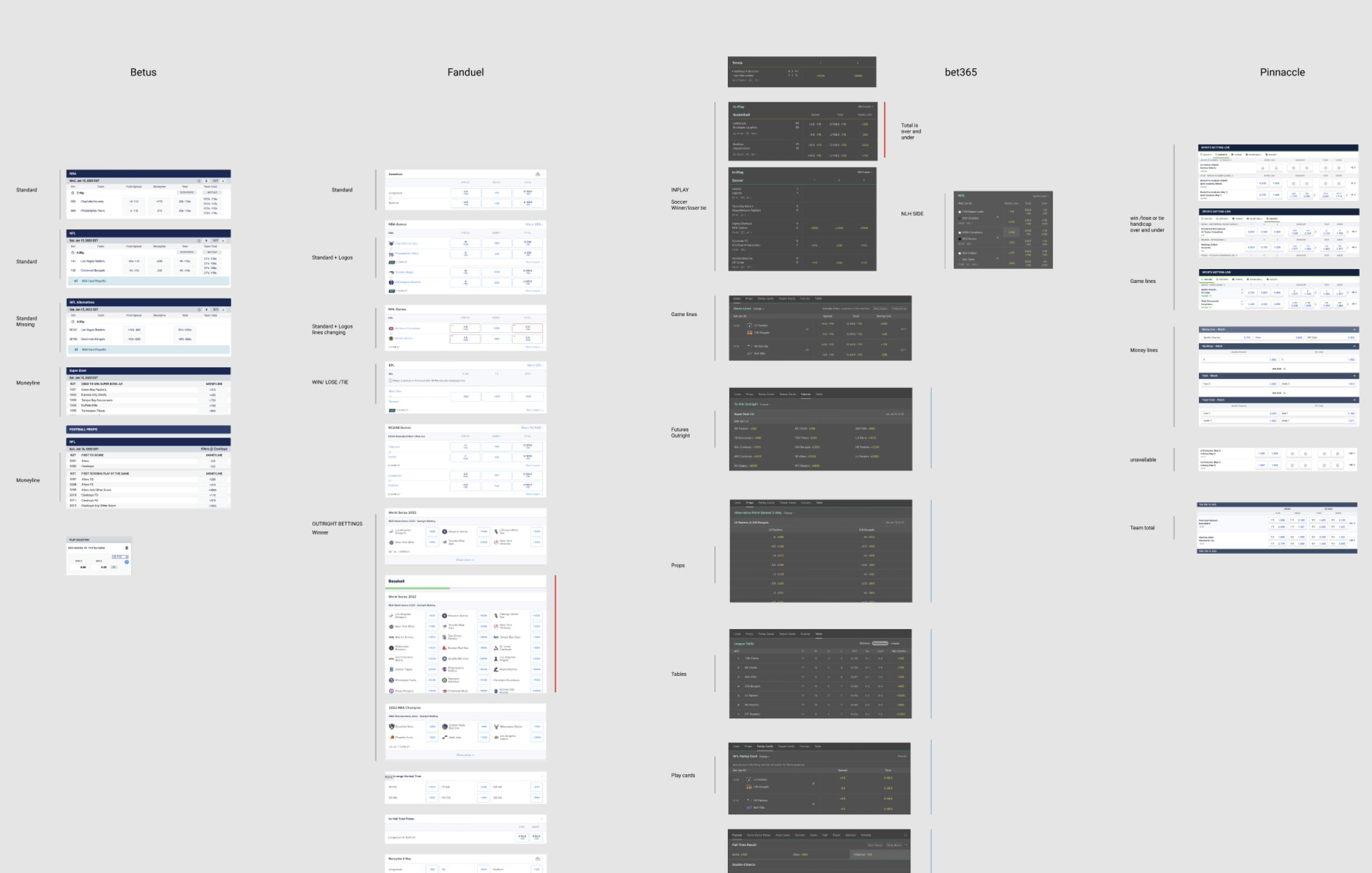
To start the redesign process, we conducted an extensive research to understand the current user pain points and issues. We interviewed BetUS users, Discovery sessions with stakeholders to gather insights. Our research showed that:


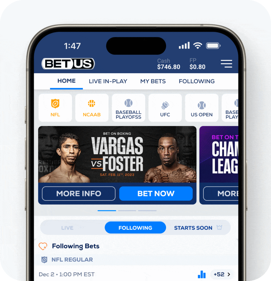
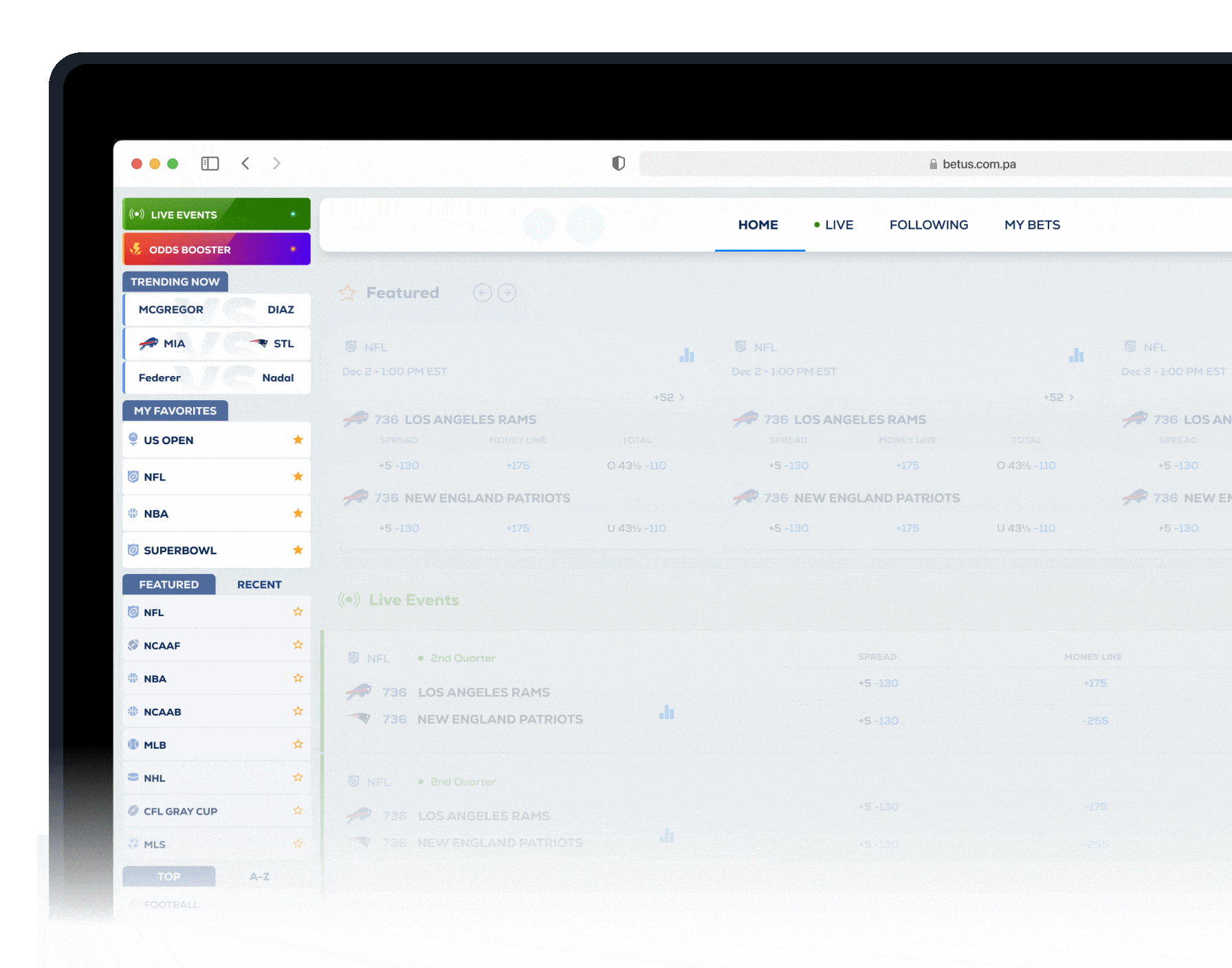
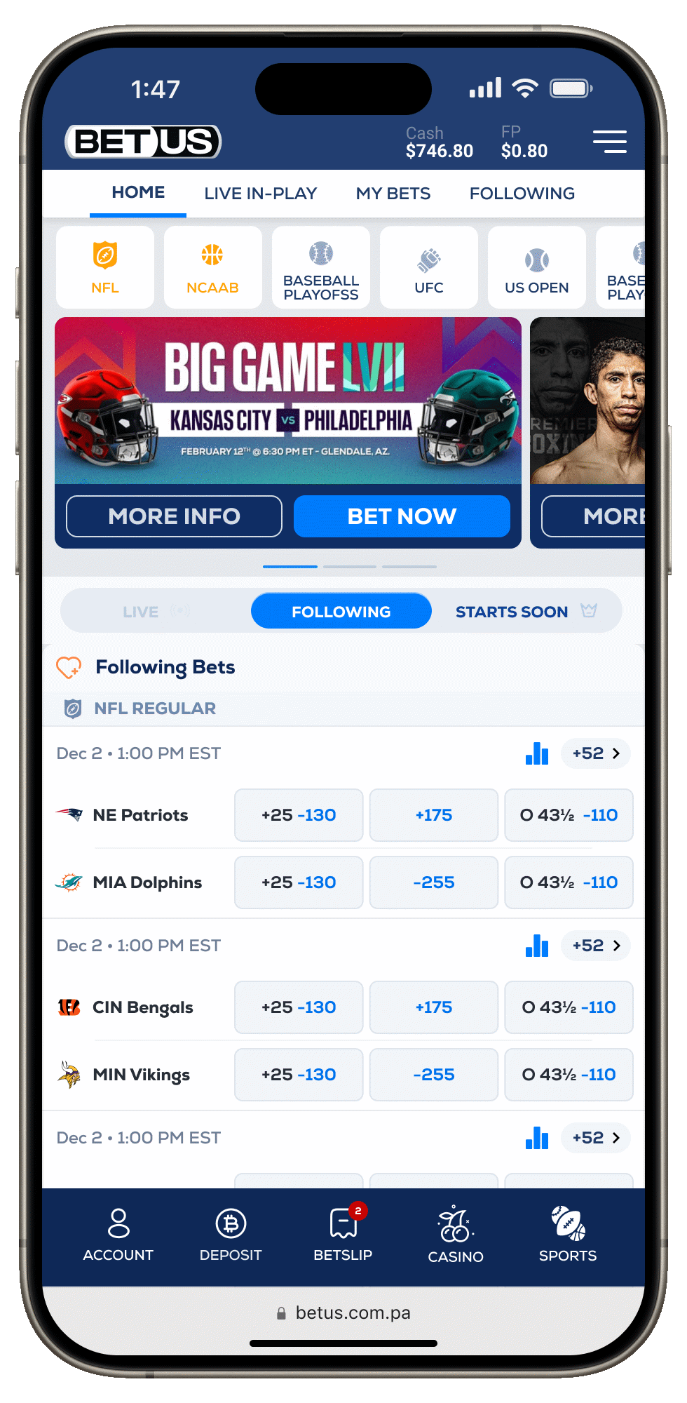
Content First : Prioritizing Lines over banners & CTA
Displaying banners and CTAs that occupied the entire above-the-fold area created friction, directing users to a home screen with little to no real value. To address this, we redesigned the layout with a content-first approach—removing distractions, eliminating unnecessary banners, and surfacing what users care about most: upcoming matches, lines, and odds
Banners and CTA’s buttons had less than 1% CTR
Removing those elements required leadership and persuasion, as the company was stuck in an old paradigm and data was scarce. The result is a first view where users immediately experience what matters most to them.
Activites & Outputs.
Content First Approach.
Redusing Banners & Showing Events above the fold
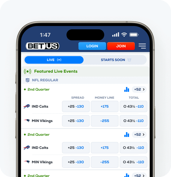
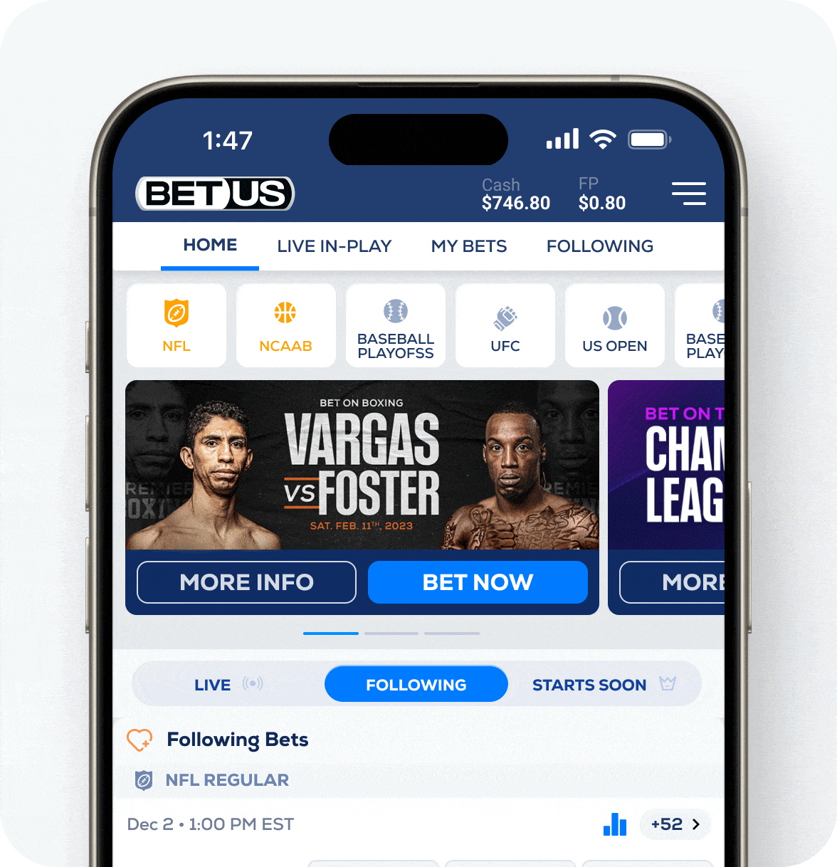
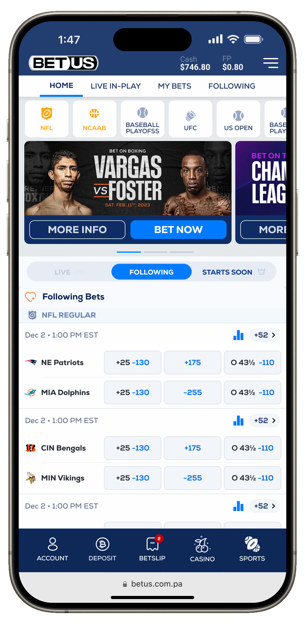
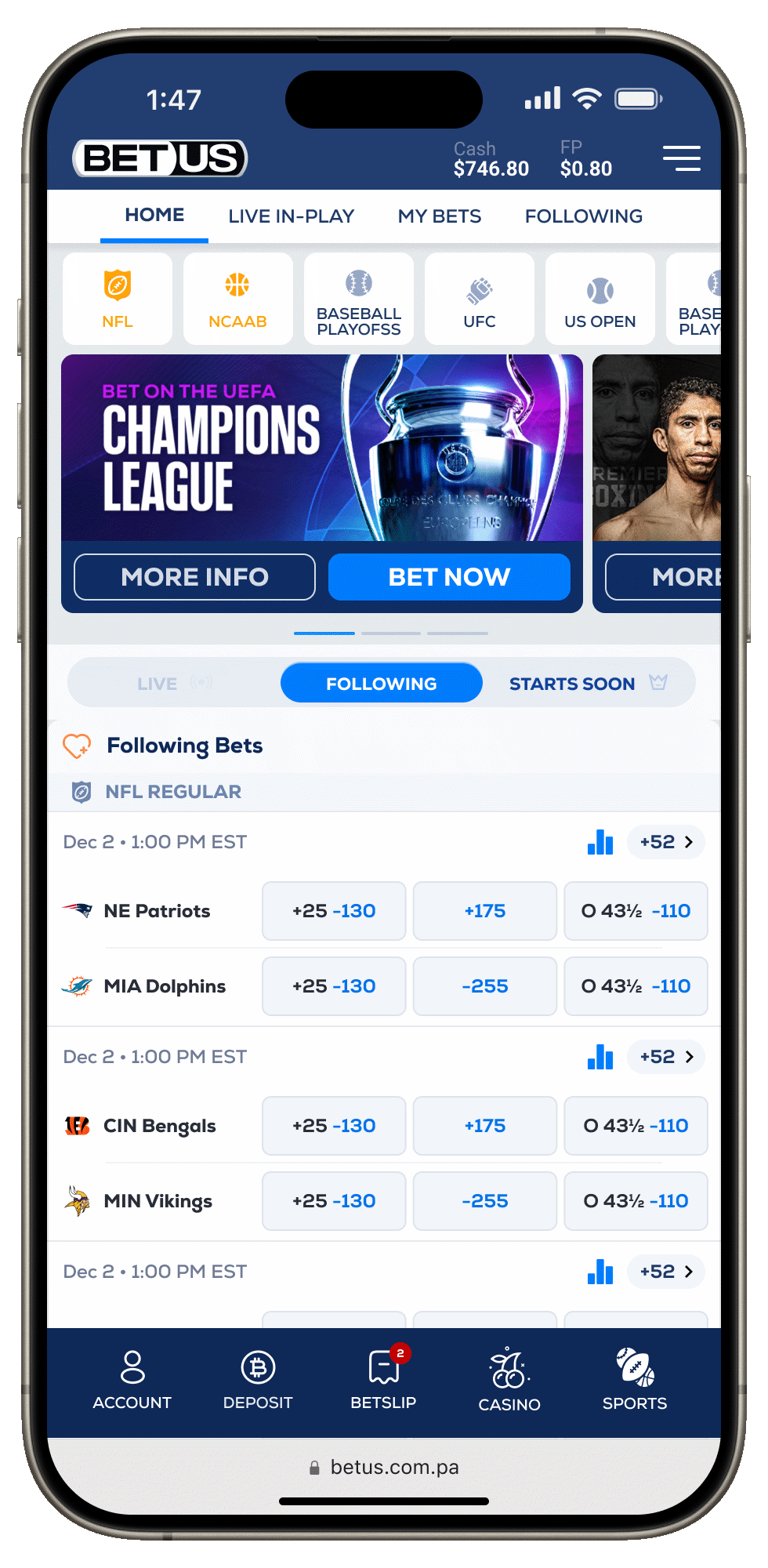
Live Events
Matches in progress placed front and center for quick discovery.

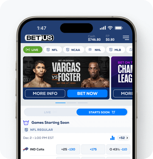
Starts Soon
Starts Soon sits next to Live, surfacing matches about to begin
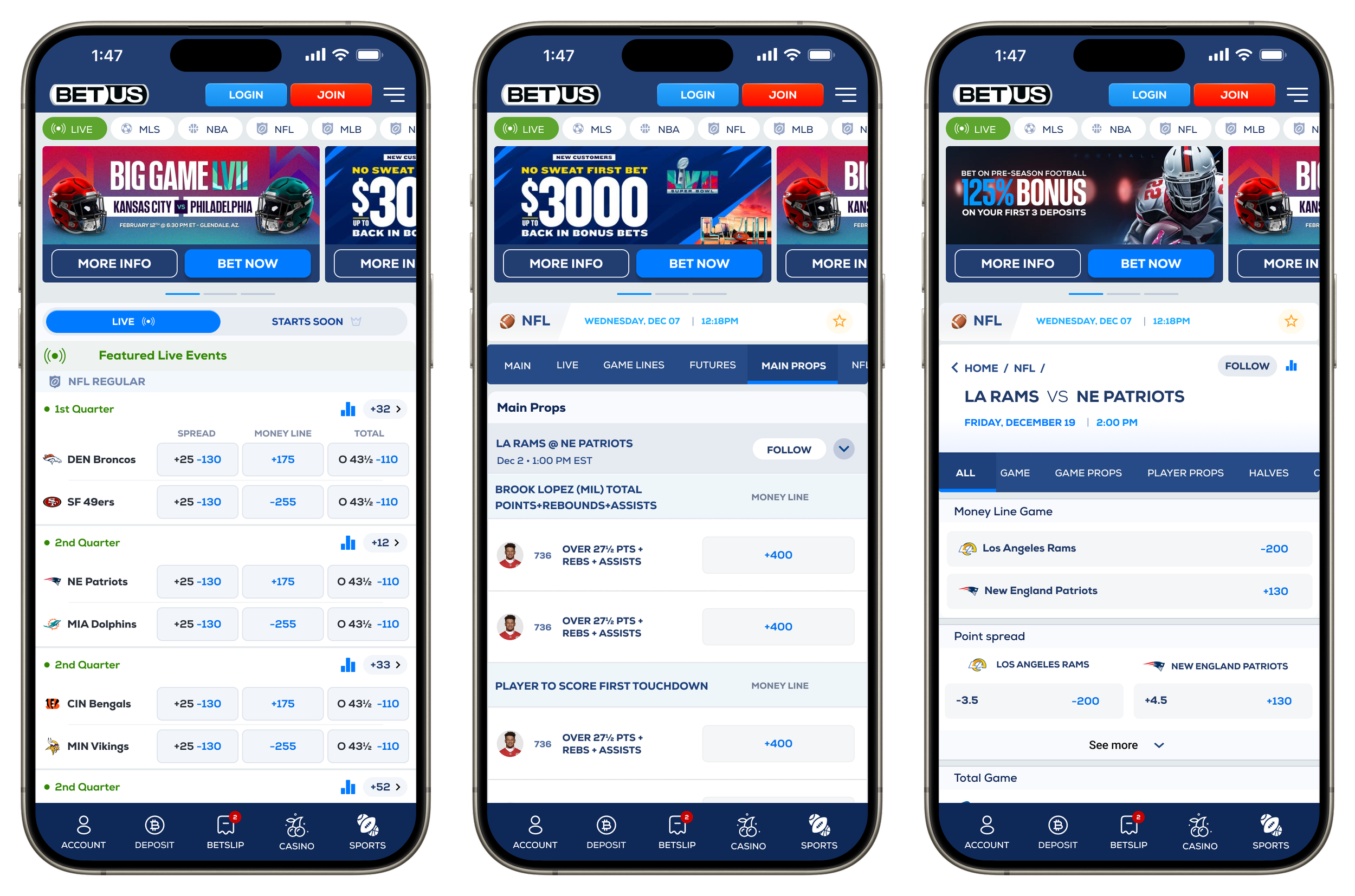
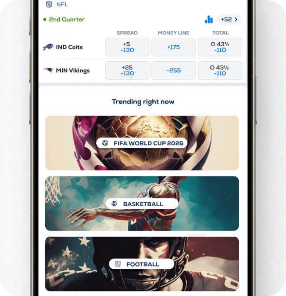
Enhancing Lines. Gaining 30% of real state
On mobile, legacy line cards suffered from poor readability, truncation of long team names, and a confusing layout. We redesigned them with clearer odds and lines, larger tap areas, and abbreviated team city names to fit within limited space. A new “Live” tag further built user confidence and emphasized real-time opportunities. The result: improved readability, smoother interaction, and higher engagement.
Lines have to be easier to understand, even for newcomers.
Activites & Outputs.
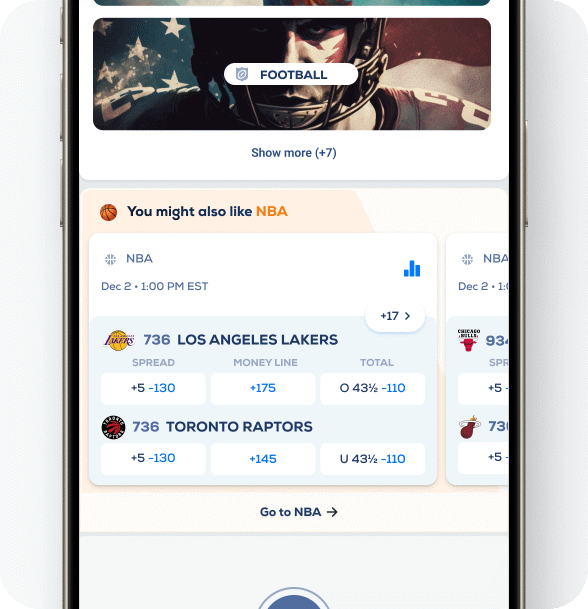
Highlighting Featured Events.
In order to strengthen our content-first efforts, I designed a dedicated space to highlight the most important upcoming games, making it easier for users to instantly recognize what matters most. By surfacing high-value matches upfront, we reduced unnecessary scrolling and extra clicks, helping users reach their destination faster and with less effort
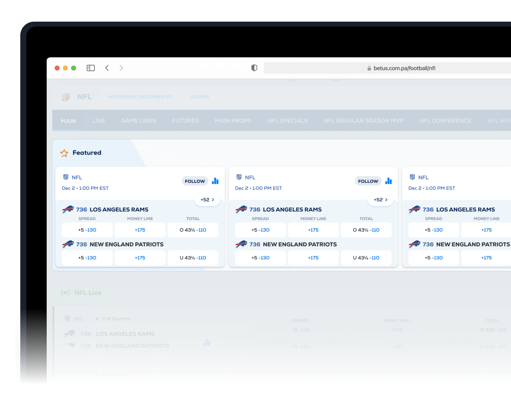
The most important events should always be immediately visible and easily accessible to users.

Activites & Outputs.
Enhancing Navigation for Sports Fans with Clarity and Speed
Reducing navigation effort by 50–75%
By introducing direct access, clear positioning, and streamlined navigation, we eliminated the major hurdles users faced. Previously, unclear navigation flows, redundant buttons, filter-heavy result pages, and the lack of a third-level menu often left users struggling to reach their desired content.
Fixing Navigation Confusion and User Disorientation by reducing amount of clicks by 75% in some cases.
From Confusing Paths to Clear Journeys. Discovery sessions allows us to understand that a third level of Navigation needed to be implemented.
Activites & Outputs.
Active States.
Incorporating button states to show user precise location.
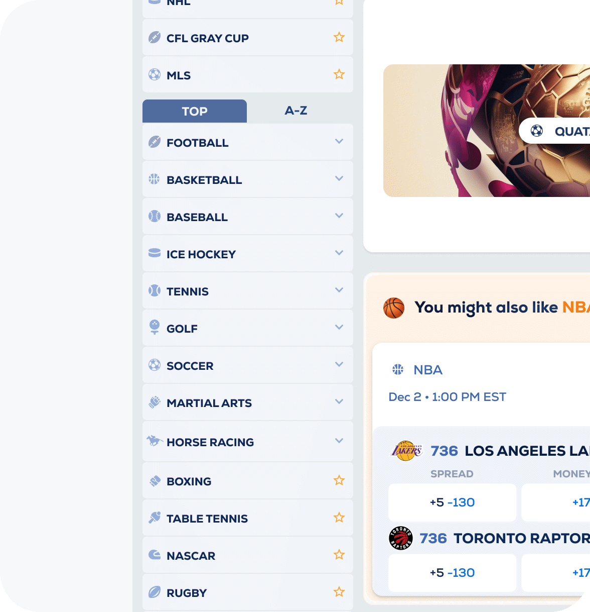
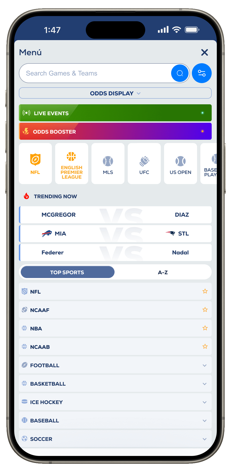
Menu Categories.
From Trending now to A-Z options to help user get fast
Quick Access to Top Leagues.
Users need simplicity to navigate in mobile.
Unlocking a New Level of Navigation. League Nav
Reducing navigation effort by 50–75%
We discovered that categories originally scattered at the same level could be confusing for users, in most cases users had to go to a higher level to then access a specific level. (Ex. go to football, to access NFL speficific conten). Through product research, we identified the opportunity to group them under one roof, making the navigation more intuitive and improving the clarity of the user path.
Scattered categories forced users to overthink, adding unnecessary cognitive load and leaving them frustrated.
Activites & Outputs.
2nd Level of Nav.
eliminating a filter step was crucial to improve the experience.
Contextual Nav.
From Trending now to A-Z options to help user get fast
Recommendations.
Users need simplicity to navigate in mobile.
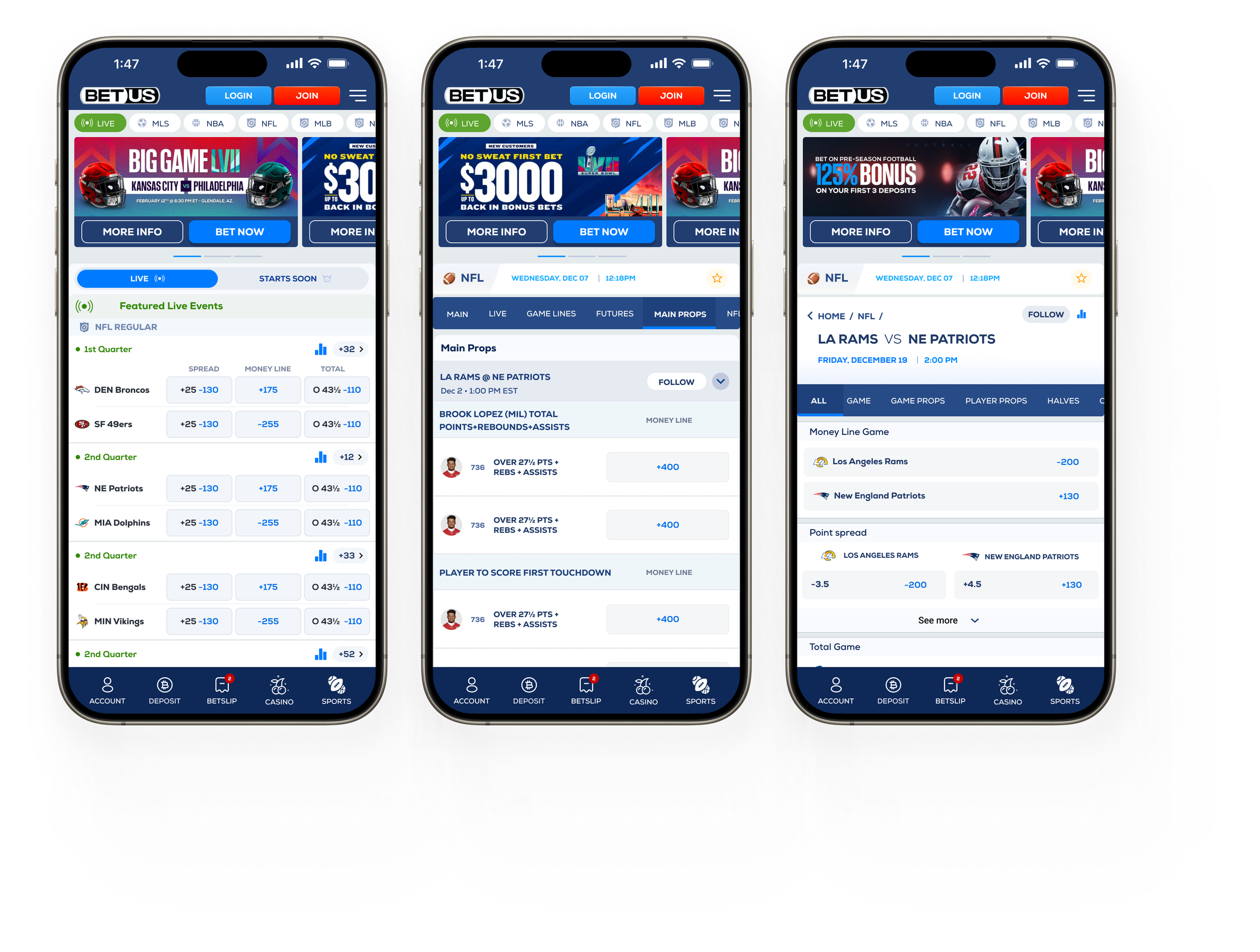
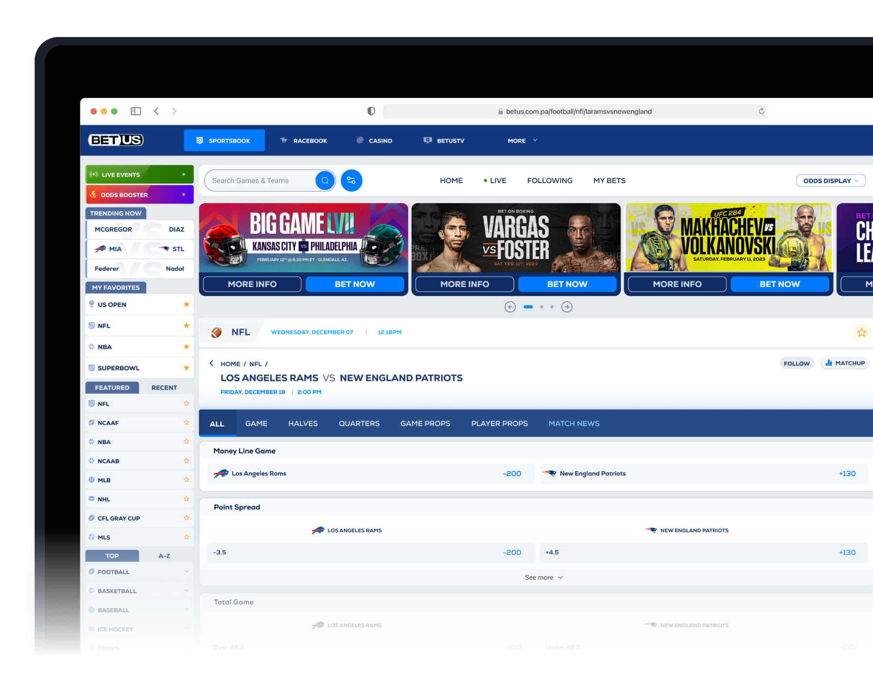
The All new Game Match Page. Event detailed page.
Introducing
We didn’t stop at the event overview—introducing an All Markets page that lets users see every available line for a specific match in one place. Previously, users had to navigate to a generic league page to access all lines, creating unnecessary friction.
When users care about a single event, they want to see every line — from the main odds to props and futures — all in one place.
Activites & Outputs.
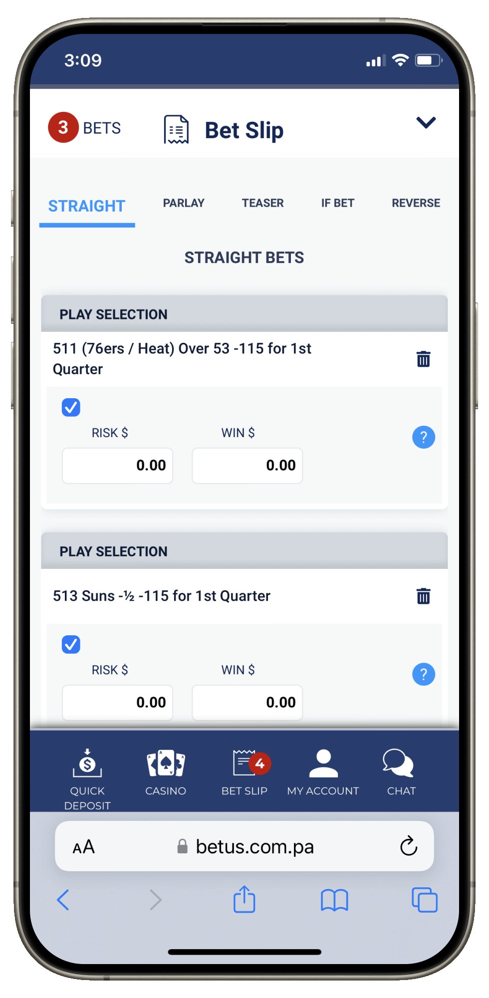
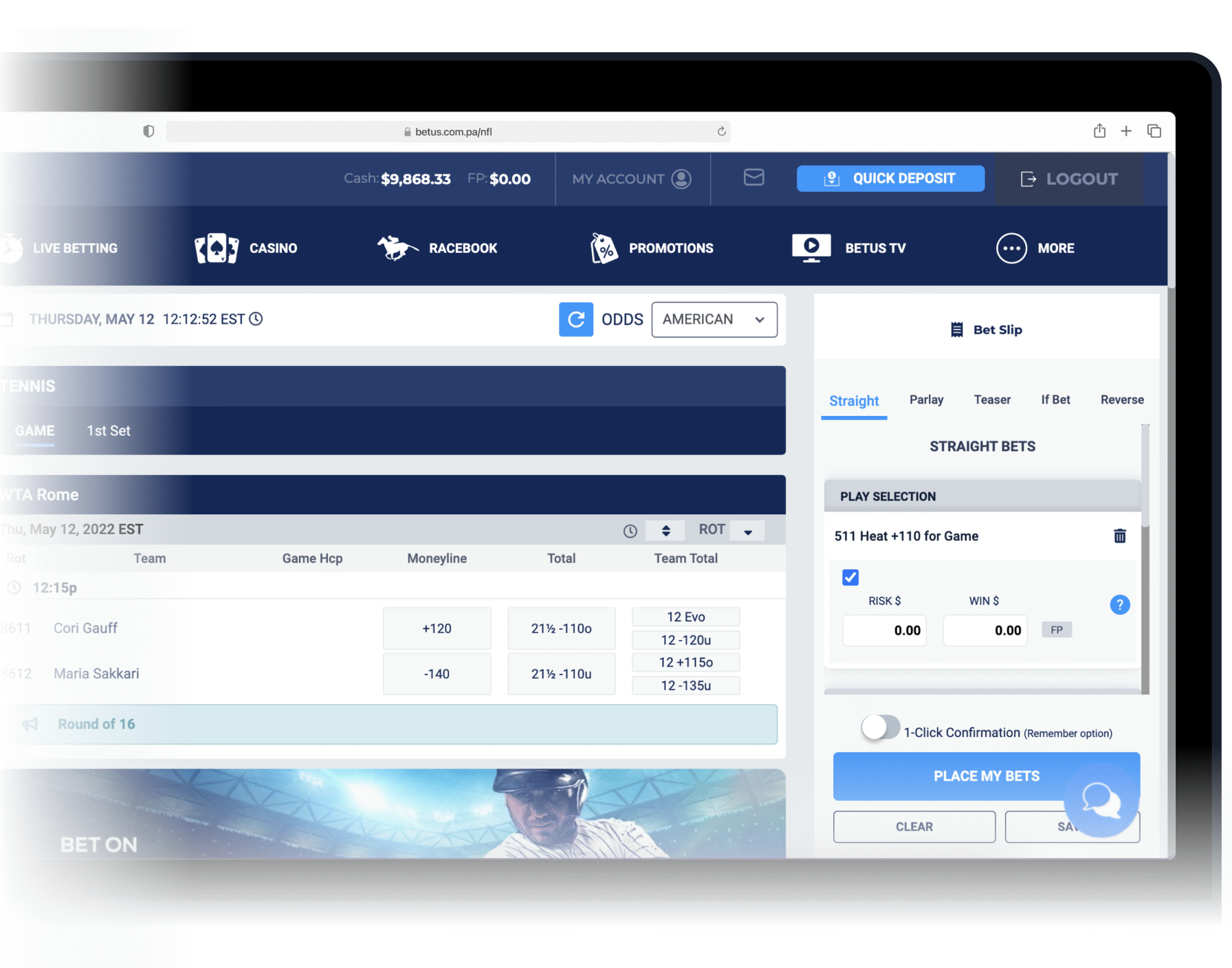
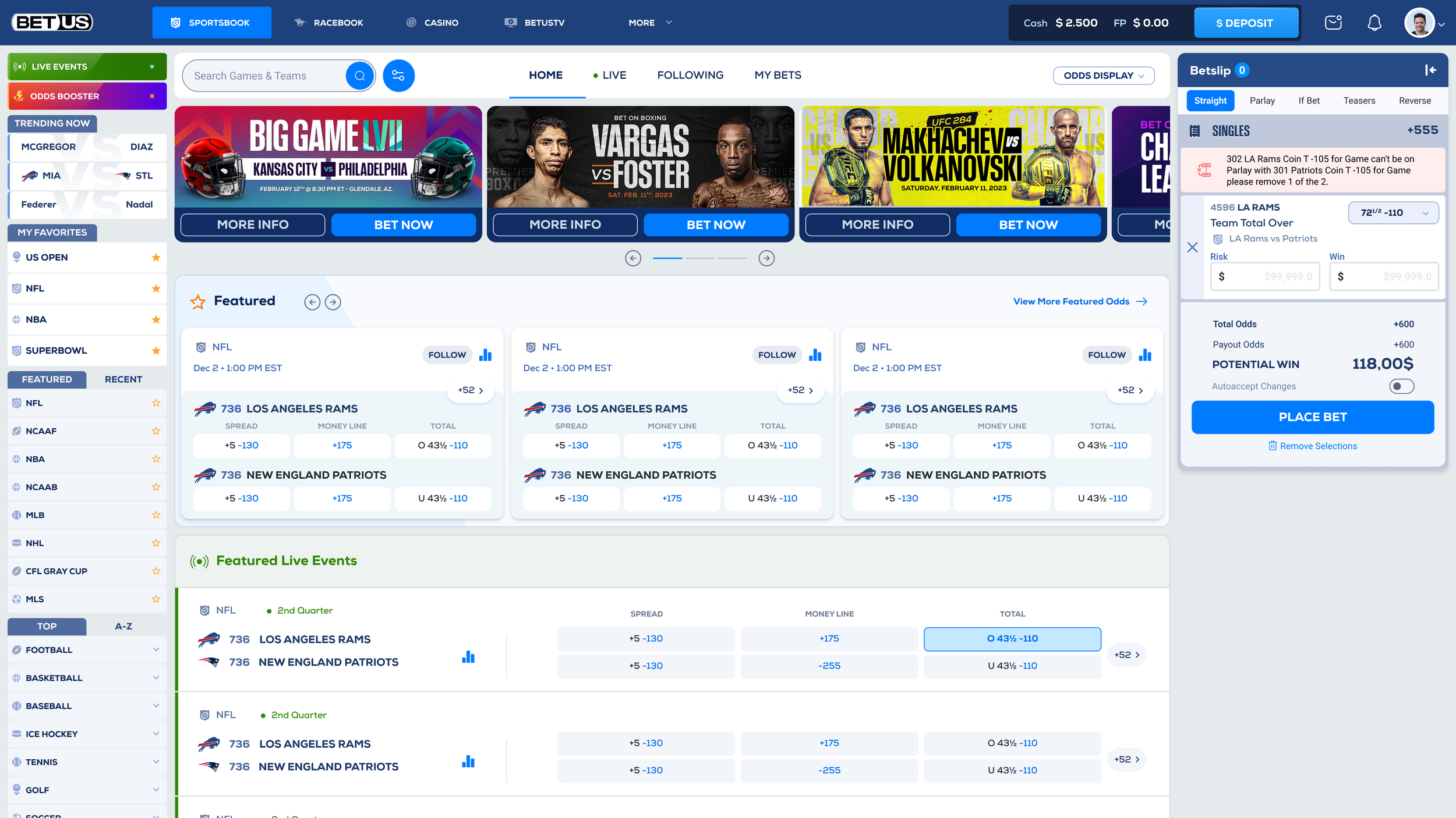
Improved visibility by 200% The new Redesign Betslip.
22% Cut Scrolling
Lines and odds were previously difficult to access due to cramped layouts and high content density. Our redesign improved above-the-fold visibility by 200%, reduced scrolling by 22%, and increased information display. Other enhancements included clearer presentation of team names, bet types, odds, and the Risk and Money input labels.
Users need a clear view of their bets, just as shoppers see items in a cart—transparent and always accessible.
Activites & Outputs.
Single Bet.
In Context One single selection.
Straight tab.
When users are interested in individual events.
Parlay Combination.
When users are betting in the outcome of multiple events.
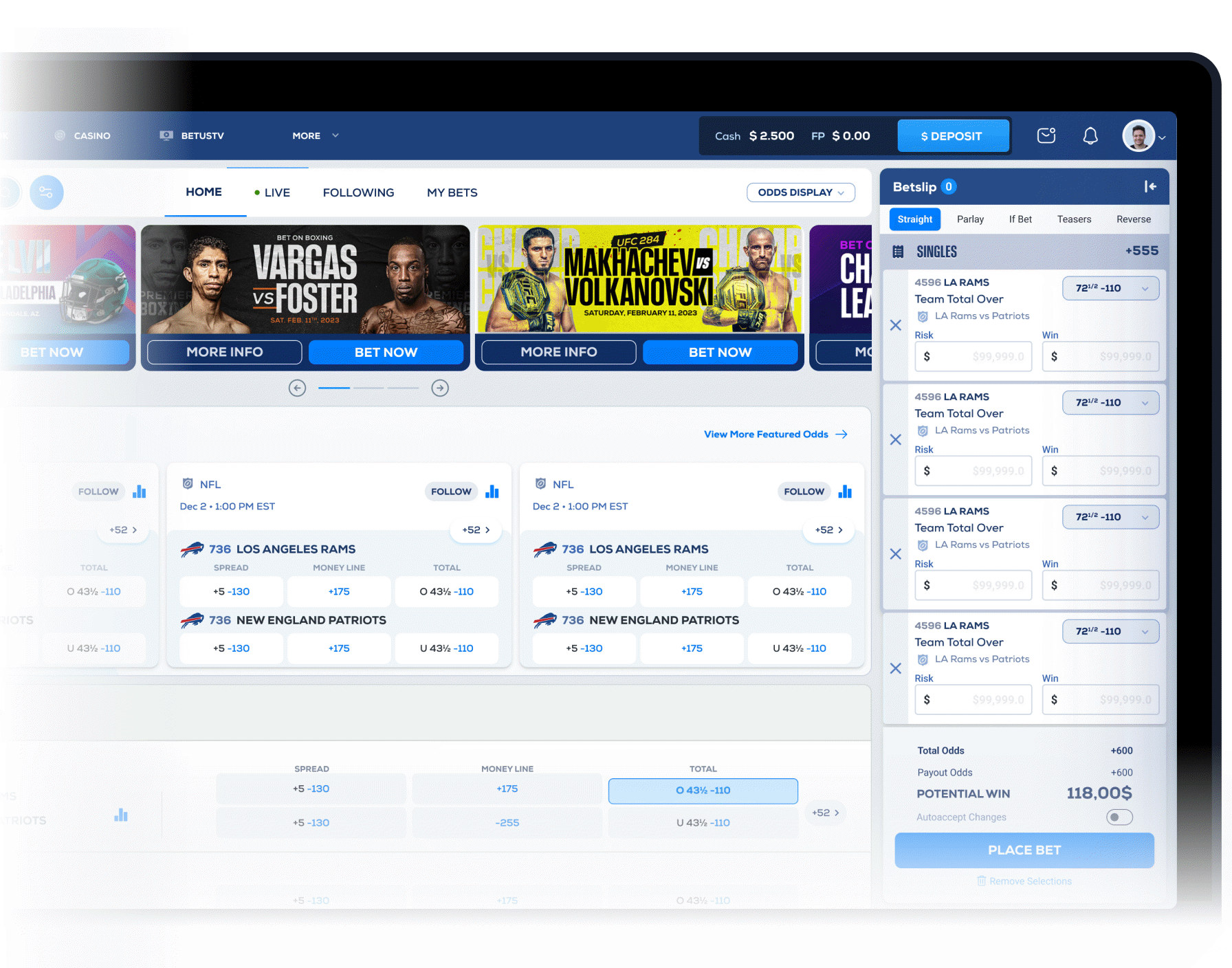
Desktop visibility by 300% The new Redesign Betslip.
22% Cut Scrolling
On desktop, the problem was even more pronounced, as users could only see one selection before needing to scroll. Lines were more difficult to access when users placed a bet due to terrible layout. Our redesign improved above-the-fold visibility by 300%, cut scrolling by 42%.
Selections in the betslip should be instantly visible, mirroring the clarity of a shopping cart experience.
Important Features
Filtering Games for Advanced users.
22% Cut Scrolling
I repurposed an existing navigation pattern and transformed it into a filtering feature for advanced users. What was once a mandatory path for all users to reach a league now serves as an optional tool for those specifically interested in filtering content.
Rather than removing the complex league navigation page, I proposed repurposing it as an optional filter feature.
Search events for quicker results
22% Cut Scrolling
The search feature helps users quickly find what they’re looking for while proactively suggesting relevant teams, events, and articles. By combining fast, accurate results with contextual recommendations, it reduces effort, surfaces high-value content, and enhances overall engagement.
The search feature is designed to stay one step ahead of the user, helping them quickly find what they need.


Filter
Designed to help advanced users to search for multiple events
Search
Designed to facilitate users get to specific events

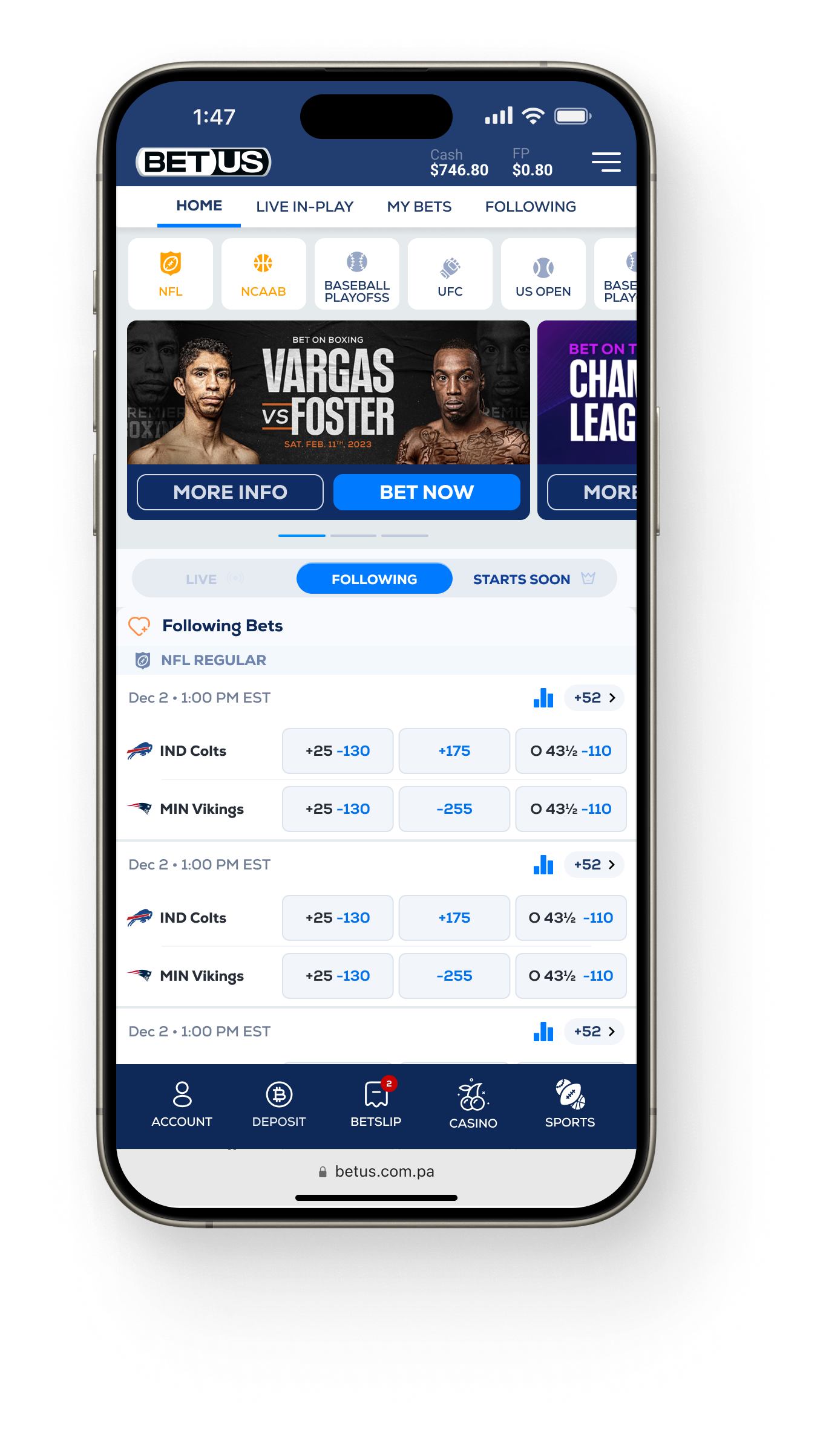
Favorites
Favourites reduces the amount of clicks to go to a recurrent page
Final Thoughts
This project was a great experience and the result of over two years of effort and collaboration. We reached the implementation stage, where I worked closely with the development team on a daily basis, refining the product through QA and continuous improvements.
Unfortunately, the project was paused due to a miscommunication between the business stakeholders and the third-party development company, which had been working with backend technology incompatible with ours.
Nonetheless, the work produced remains highly valuable. The designs, insights, and solutions developed can still be applied to improve the site in future iterations, ensuring the impact of this project continues beyond its pause.

Main League

Filter

Logged-in User
1 bet selected

2 bets selected
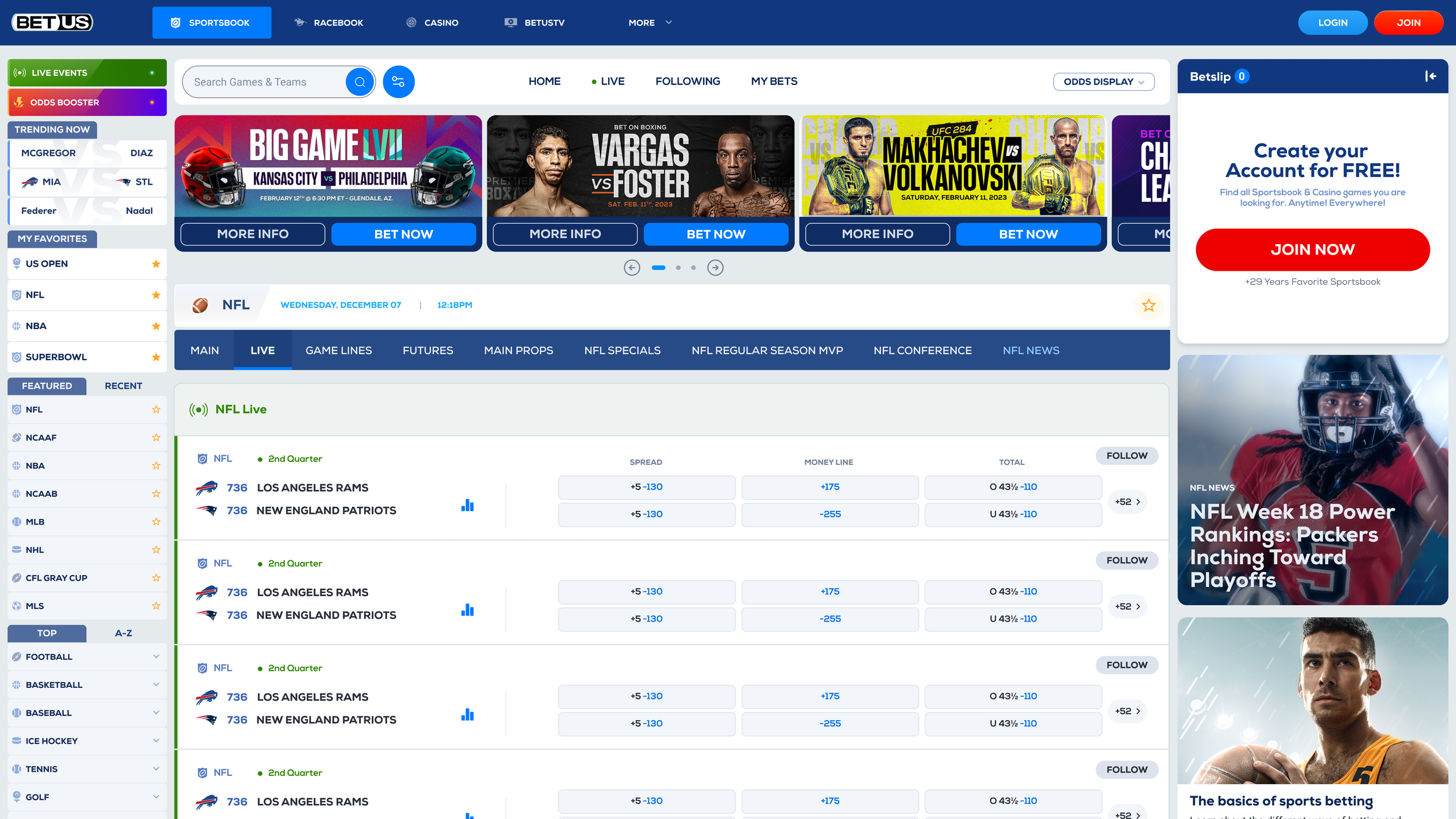
Live games

Game Lines
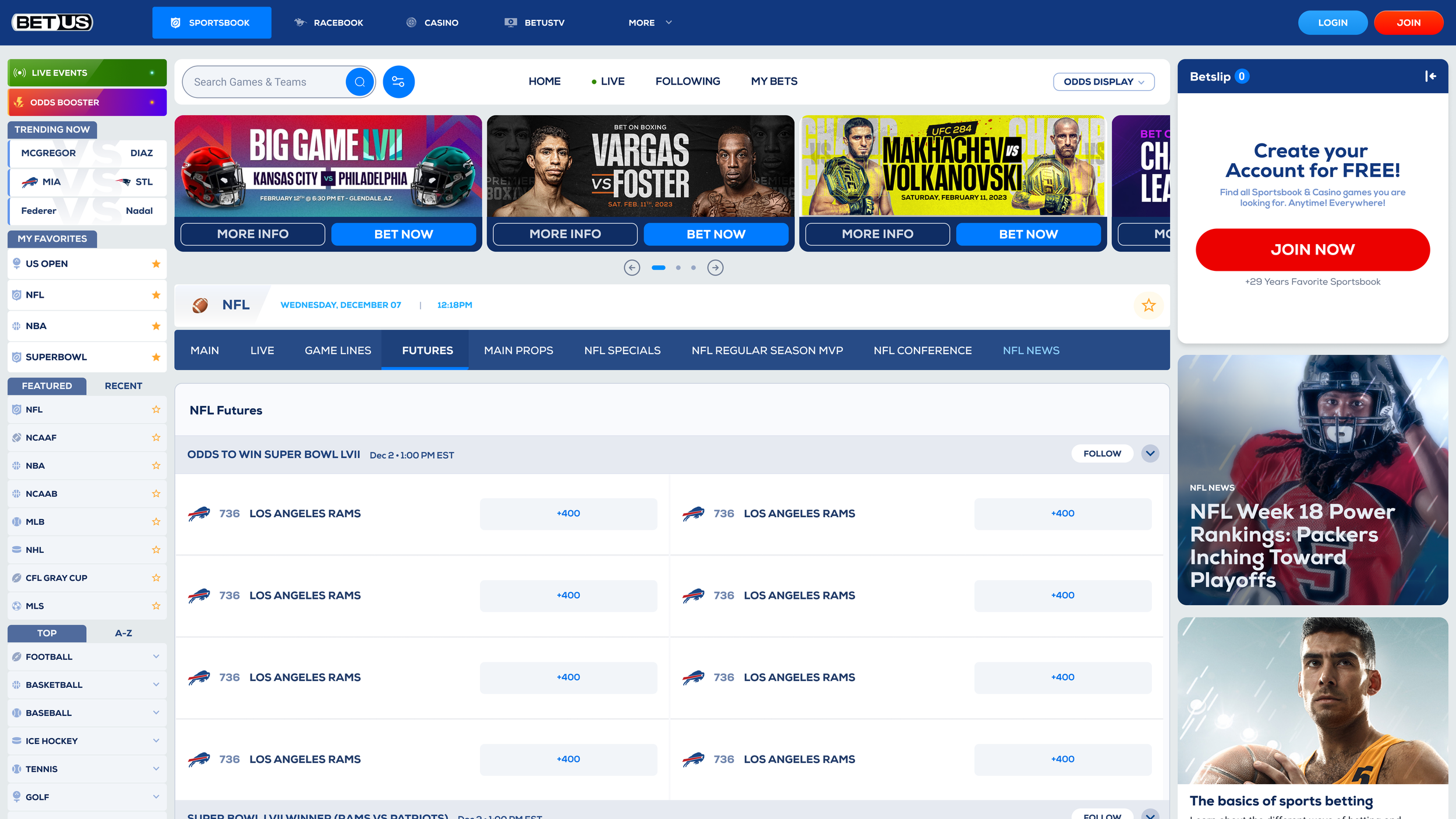
Futures
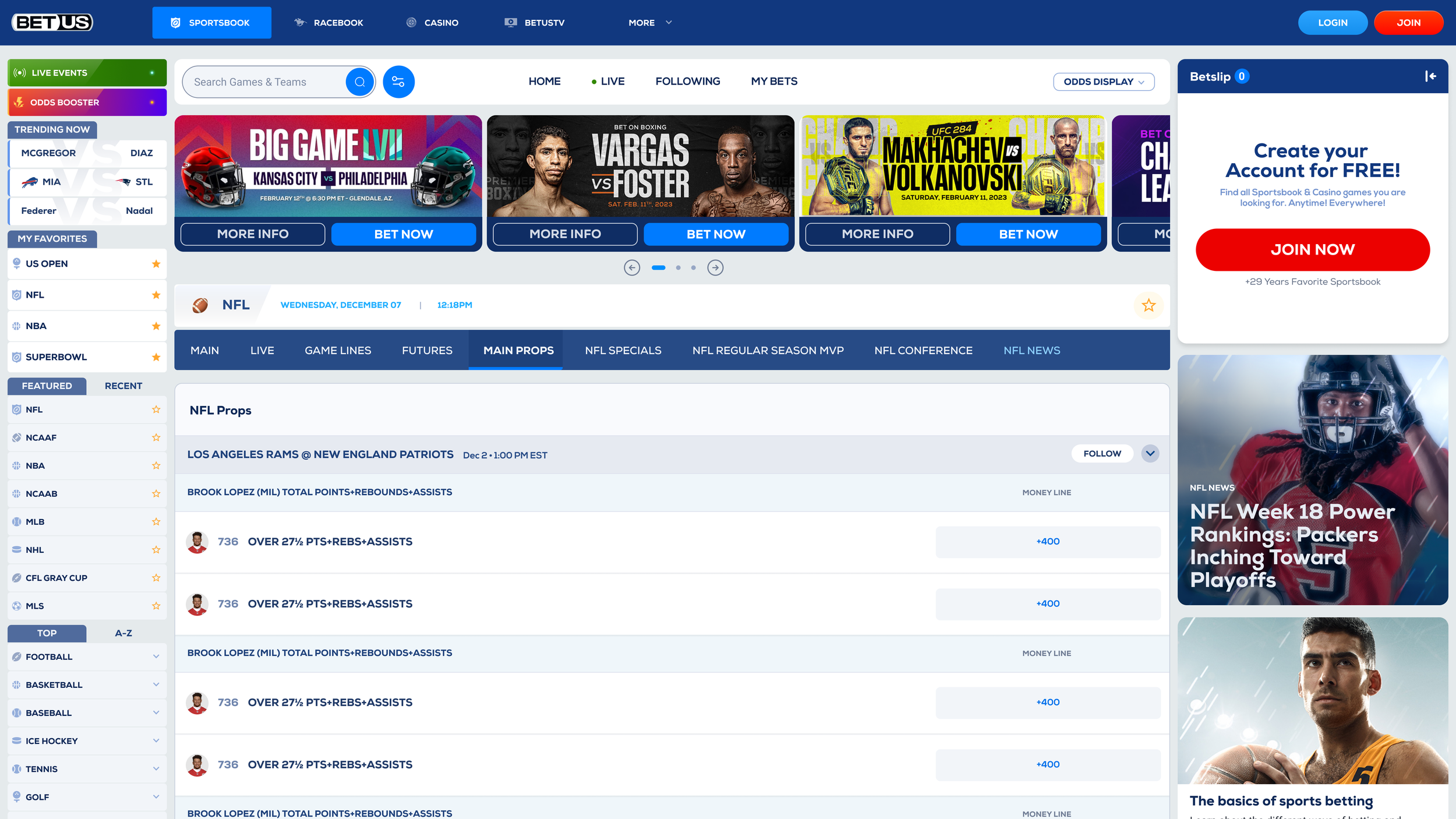
Main Props

Event Detailed page
Next up.
Don’t miss out on exploring the other projects I’ve had the chance to work on, each with its own set of challenges, learnings, and design solutions..

Videri iOS new app.
Deposit Flow.
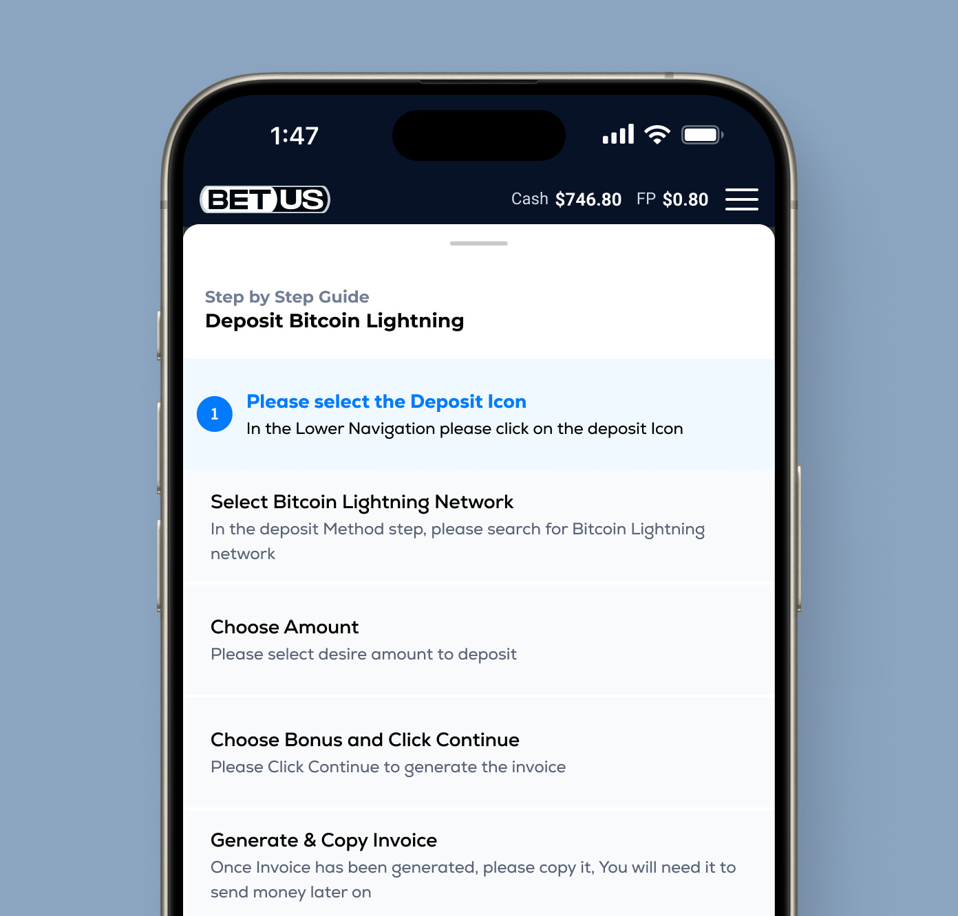
BTC Lightning.
Behind the Scenes - Wireframes & Prototypes
Behind the Scenes - Wireframes & Prototypes
Discovery - Wireframes - Prototype
Exploring Different types of Navigation.
Lines and odds were difficult to access when users placed a bet due to poor layout. Our redesign improved above-the-fold visibility by 200%, cut scrolling by 22%, and enhanced comparison and engagement.
Discovery - Wireframes - Prototype
1st Iteration of Wireframes.
Lines and odds were difficult to access when users placed a bet due to poor layout. Our redesign improved above-the-fold visibility by 200%, cut scrolling by 22%, and enhanced comparison and engagement.
Reducing the need for scrolling 22% ered categories forced users to overthink, addi.


Discovery - Wireframes - Prototype
Dockable Betslip for multitasking.
I designed a dockable betslip with the goal of enhancing navigation, allowing users to interact and multitask seamlessly with our product, enabling users to simultaneously browse other events while keeping track of their current selections.
Discovery - Wireframes - Prototype
User interacting with Betslip.
This Prototype explores the design and usability of a dockable Betslip. The dockable Betslip is a revolutionary feature that I have passionately conceived, and it is a pioneering addition that currently sets it apart from existing solutions in the market
Discovery - Wireframes - Prototype
Proggresive Disclosure & odds change.
This Prototype explores the design and usability of a dockable Betslip. The dockable Betslip is a revolutionary feature that I have passionately conceived, and it is a pioneering addition that currently sets it apart from existing solutions in the market
Parlay Push & Docking for multitasking
Discovery - Wireframes - Prototype
This Prototype explores the design and usability of a dockable Betslip. The dockable Betslip is a revolutionary feature that I have passionately conceived, and it is a pioneering addition that currently sets it apart from existing solutions in the market
Navigation Levels & Bet placement
In the initial iterations of mobile, we focused on enhancing key aspects such as navigation, information density and display, navigability, and content prioritization. These improvements were crucial to creating a more user-friendly and engaging experience for our mobile app users.
Our primary objective was to ensure that users could view their bets right from the start, without any obstacles or unnecessary steps. We recognized the importance of providing immediate access to this critical information, thereby enhancing the overall user experience of our mobile app
Functional Prototype.
the objective in designing this prototype was to provide a tangible representation of our product's key features, allowing stakeholders to experience its immense potential firsthand. By creating this prototype, I aimed to convey the unique advantages and capabilities that solves the problem we faced in the product.
The current website launched in 2009 and after operating for 12 years, it’s starting to show usability issues amongst others. BetUS is in the process of rebranding itself with the objective of disrupting the industry and impressing their clients.
The Problem.
• Complicated User Journey
• Users unawareness of their current Location
• Alternates & Props harder to locate and navigate
• Betslip / Shopping cart experience unclear.
• Low CTR among Marketing banners (avg 5 %)
• Above the fold space is not being used properly
• Missing features like favourites or follow events.
• Poor website navigation
• Event Detailed page Non-existent


Betus Sportsbook
Thank you for Watching!
Thank you for taking the time to watch this case study all the way through. This project was the result of countless hours of dedication, problem-solving, and creativity. Every step—from ideation to execution—required deep thought, refinement, and a commitment to delivering something truly valuable.
I appreciate your interest in my work and hope this case study provided meaningful insights into our process, challenges, and the innovative solutions I developed. Your time and attention mean a lot to me, and I am excited to continue pushing boundaries, learning, and creating impactful experiences.